 |
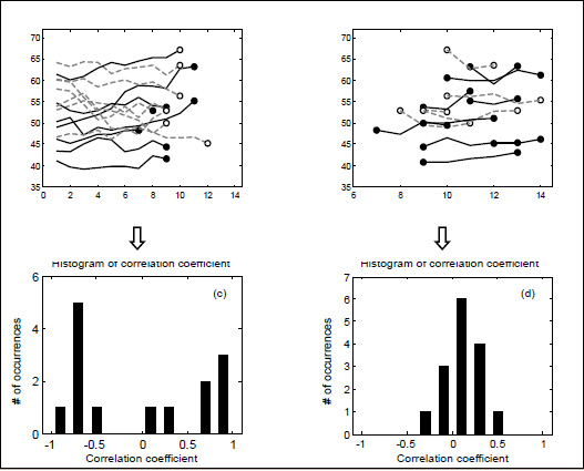
Figure 2.
Upper panel - Lines representing the changes in median frequency (Fmedian) from the onset of the incremental cycling test until the power output corresponding to the ventilatory threshold (T-vent) (a) and the changes from T-vent to the maximum power output (b). Black solid lines represent the subjects for which Fmedian showed an increasing trend, whereas grey dashed lines denote the subjects who showed a decreasing trend. Bottom panel - Histograms of the Pearson correlation coefficients obtained from the relations between Fmedian and time for the intervals defined in (a) and (b).