 |
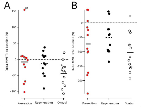
Figure 1.
Scatter dot plot. Figures depict the changes in MIVF to baseline at T1 (Figure 1 A) and T2 (Figure 1B). The dotted line crossing zero illustrates whether changes indicate loss or gain of force. Smal lines indicate the mean change within the three groups, i.e. prevention (red), regeneration (black), control (open circles). There was one outlier (subject 31) with reasonable raw data.