 |
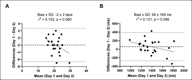
Figure 1.
Plots of the differences between Day 1 and Day 2 vs. the mean of the paired measurements for the number of taps (A) and the reaction time (B). Dashed line represents the systematic bias and dotted lines represents the upper and lower limits of a agreement.