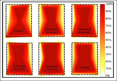
Figure 2. Participant’s individual heat maps calculated for each set of squats. The heat map for each squat repetition was averaged across the entire set yielding one heat map per set of 10 squats. Also shown above is the goal biofeedback shape represented by black dotted lines. The chosen participant’s heat maps were representative of average participant behavior and had the closest pre- and posttest means to the group averages. The darkest red (i.e., 100%) indicates that the stimulus occupied that space the entire period of time and white (i.e., 0%) indicates that the stimulus never occupied that space. A heat map indicating a perfect performance would fill the entire space within the goal lines (black dotted lines) with a dark red color and the space surrounding the goal lines would be entirely white.